Swakirti Sidhu
Nintendo Switch and Nintendo Lite Re-Design for
Low Vision Users
Following the feedback from low vision users, re-designed 3 features of the Nintendo Switch & Lite

Overview
Project Type:
Accessibility and Inclusive Design, UX Research and Experience Design.
Tools: Figma, Zoom, No Coffee Visual Simulator
My Role:
Identified and proposed barriers faced by low vision users. Completed user research by conducting interviews, prototyped design and finally presented re-designed solutions.
Skills:
User research, user interviews, prototyping and usability testing.
Duration: October 2020 - December 2020
Team:
Laura Klamot, Siqing Zheng,
Swakirti Sidhu, Taamannae Taabassum, Tim Huynh
The Problem
Low vision users face barriers while using the controller, the setting menu, home screen and while playing games because of the following issues:
-
Same button colours on the controller
-
Tiny text and UI
-
Lack of contrast between the UI and the background
The Solution
Included following features in the redesign and improved the accessibility.
-
Coloured letters on the controller button with raised buttons, offered with sticker sheet.
-
Flexible font and UI scaling at system level
-
Preset colour filters allowing customization.
Design process
I followed design process by conducting research, cycle of exclusion exercise, ideation, prototyping and evaluation.
-
Competitive Analysis
-
User research
-
User interviews
-
Cycle of Exclusion
-
Problem statement
-
Sketching new Ideas
-
Mid-fi Design
-
A/B Testing
-
Methods and Process
-
Issues and consequences
-
Large Impact
-
Next steps
Research

About the System
Nintendo Switch is a video game system created by Nintendo. It is composed of console + dock + controllers + software

Nintendo Switch, released in 2017
Nintendo Switch Lite, released in 2019
Accessibility Features Currently in the System
Controller Button Remapping

Colour inversion and Greyscale

Zoom In Feature

Adaptive Controller

Cycle of Exclusion
Adopting to the cycle of exclusion exercise we identified various potential barriers that users might face in different spectrums.
Mobility
Needing both hands to play switch light
Financial
Spending more on buying peripherals to make the game accessible
Audio
No visual cues regarding the directions that audio came from
Visual
Tiny text is hard to read, lack of visual contrast in games
About the User
Low vision is a visual impairment that affects visual acuity or leads to visual field loss
Common types :
-
Loss of central vision
-
Loss of peripheral vision
-
Blurry or hazzy vision
-
Reduced contrast sensitivity
-
Glare light sensitivity
-
Night blindness
Initial Research Insights
We did initial research by analyzing the switch and by conducting competitor analysis. We evaluated current Nintendo Switch and Nintendo Lite system and discovered various problems by reading various research papers and game accessibility guidelines.
Tiny Text
Buttons Colours
Lack of Contrast
No Text to Speech
No Directional Pointers
Narrowing the Scope
We interviewed Bryce Johnson, Inclusive lead at Microsoft Devices and had an informal chat with someone who is blind in one eye from Reddit/disabledgamer asking about their opinion on our plan. With their expertise and experience we managed to narrow down our focus on three issues to fixed.

Button Colour Contrast

Tiny Text

Lack of UI Colour Contrast
Ideation and Prototyping
For each issue, we outlined our proposed solution in a google doc that was then shared with our target users for feedback on our ideas to test their efficacy. This document was given to:
-
Simon Barnett, an accessibility technology teacher
-
Two users from reddit disbaledgamer page
Usability testing Participants:

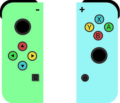
1. Physical Inaccessibility
Same colour physical keys makes it hard for the individual with visual impairment to see which button they have to press.
.png)
.png)
Nintendo Switch
Nintendo Switch Lite
Low vision players, especially if less experienced, want the face buttons to be more salient for easier reference.
Our Solution
According to WCAG guideline 1.4.1, colours should not be used alone, therefore we decided to combine colours with letters so that it is easier to find and process.
.png)
or
Version 1: Switch with coloured buttons with dark text
.png)
or
Version 1: Switch Lite with coloured buttons with dark text
.png)
Version 2: Switch with coloured letters on the buttons
.png)
Version 2: Switch Lite with coloured letters on the buttons
User Feedback and Redesign
"Use coloured letters on the buttons and let the letters be raised on vs concave into so that the user can feel the alphabet and know what they are pressing without looking at all at the buttons"
P2 : Michael Feir, personal communication, November 16, 2020
.png)
Nintendo Switch Lite with coloured and raised letters on the buttons
.png)
Nintendo Switch Lite with coloured and raised letters on the buttons
Our informal chat with Simon Barnett showed the need of customization. The colour maybe inaccessible for people with autism. To account for this, we decided to offer sticker sheets along with redesigned Nintendo Switch so the user can pick their own colour.
2. Tiny Text and UI Scaling
Tiny text and UI scaling is common issue in games and it can make games uncomfortable or impossible to play.
Low vision user want text to be more readable
Game accessibility guideline recommends having a large default font size (28px on a 1080p screen, Switch is 1280 x 720 so there maybe some leeway). Adjusting font size should also be allowed.
.png)
.png)
Tweets from game accessibility advocates Steve Saylor and Cherry Thompson
Tiny text in action
As mentioned in Steve Saylor tweet Fire Emblem : Three houses is a game with small text. It is a great game but because the text is tiny it is very uncomfortable.
.png)
Fire Emblem: Three houses ( Handheld)
.png)
Fire Emblem: Three houses ( Docked to a TV)
Our Solution
Allow for flexible font and UI scaling at a system level, so players can adjust the size to suit their needs. It won't affect the games themselves but its the first step.
.png)
A mockup showing our New Display Menu, where we have grouped settings related to display. This includes the existing Zoom feature and our New Screen Filters and Font Scaling Setting
.png)
System Setting at Medium 100%
.png)
Nintendo eShop widget at Medium 100%
.png)
Font scaling adjusting option using a slider between extra small to extra large
.png)
System Setting at Large 125%
.png)
Nintendo eShop widget at Large 125%
Our flexible gaming design is also based on following Game Accessibility Guidelines
Guideline1
Use an easy readable default font size
Guideline 2
Allow font size to be adjusted
Guideline 3
Allow interface to be resized
3. UI Contrast
Many game interfaces are inaccessible due to contrast. Below is a screenshot from The Last of Us I showing how difficult it can be but the game developer added a high contrast setting for inaccessibility in The Last of Us II.
.png)
The Last of Us I : Default UI
.png)
The Last of Us II : High Contrast UI
Low vision user want on screen elements to be more visible
User Feedback
Bryce Johnson Tips:
-
Make filters easy to access in games
-
Create presets that people choose from
-
Look at controls like Vibrancy and Saturation
Our Solution
We used No Coffee Visual Simulator to explore different types of games and different type of low vision issues to create potential presets.
Diabetic Retinopathy


Low Contrast
.png)
.png)
.png)
.png)
Contracts
.png)
.png)
.png)
.png)
Prototype and Easy Access
We created a prototype in Figma to stimulate how it might work on the switch and for the fast as well as easy access we kept the filters in the in game menu.

Video showing prototype for the filters in the game menu
A/B Testing
We came up with 3 different ways of doing filters, with varying level of choice. We focused on principals of ease of access and customization.
.png)
Idea 1:
Preset Filters only
OR

Idea 2:
Create Personal Filters
OR
.png)
Idea 3:
Use existing preset as a base to make more
User Feedback and Redesign
Participants P1, P2 and P3 liked the option 3 which was giving users presets that they can duplicate and edit
"Having presets that are already created provides a base and then just tweaking is required. Additionally, labels for all the sections provides the ability to organize and helps in case any text to speech ability is added in the future "
P3 , Personal Communication, November 24, 2020
.png)
Evaluation
Methods and Process:
Heuristic Evaluation
With gamers on the team we were able to conduct internal heuristic evaluation (existing knowledge)
Expert Feedback
Industry insider/inclusive designer (insights, guidance) & Access and Disability Specialist
User Feedback
We received feedback from low-vision gamers and non gamers opinions and lived experience.
Issues and Consequences:
Buttons
Need new controllers or button cover
Scaling
Mostly for system menus
Filters
Issues with local multiplayer, filter preset needs validation
Large Impact:
"[Games] play alongside the operating system"
System software is parallel to game software
Best options will always be within games
Game makers are most responsible for accessible games
No WC3/WCAG for video games yet
Proposed solutions are immediate, narrow and pragmatic
Next Steps:
In the immediate future we would do more user testing and get feedback from low vision players, identify things to improve and then produce interactive prototypes. Beyond user testing and prototyping, we would address the issues and consequences that would result from our solution
Future design to evaluate : Text to speech
This is a feature that the recent Xbox and playstation consoles has as well, yet the Switch lacks. Nintendo will benefit from this change by removing barriers for low vision users and staying competitive in the market.

A mockup showing where a new text to speech function could potentially exist within the switch menu. All existing sound related options have been moved to new Audio menu to make them easier to find. The design is not shown to the user but is based on our user feedback
" Many users would really want text to speech for the switch UI as well. I am happier with the larger text"
P3, personal communication, November 24, 2020
Reflection
This project made me appreciate the 'Power of One' and how 'Accessibility for few becomes Usability for many'